MigSolv
Founded in 2002, MigSolv was the UK’s only consultancy dedicated solely to data centre environments. With its flagship facility, The Gatehouse in Norwich, recognised as one of the most secure data centres in the country, MigSolv established a reputation for excellence across both infrastructure and consultancy services.
Previously operating under two distinct identities—Migration Solutions for consultancy and Sentry42 for data centre operations—the business unified under the MigSolv brand in 2011.
The Challenge
MigSolv worked with me at pivotal moment. Having operated for years with a fractured identity, it was the shared belief of the CEO, Operations Director, and a new investor that the business needed a fundamental brand rethink.
The objectives were ambitious:
-
Unify the dual aspects of the business under a singular, coherent brand.
-
Retain legacy brand equity, particularly the trust and recognition associated with Migration Solutions.
-
Reimagine the visual identity to better reflect the company’s innovative and forward-looking mindset.
-
Transition from a traditionally corporate look-and-feel to something more human, vibrant, and accessible.
-
Redesign the company’s digital presence to reflect these changes and better serve its core audiences.
Visual Identity & Brand Strategy
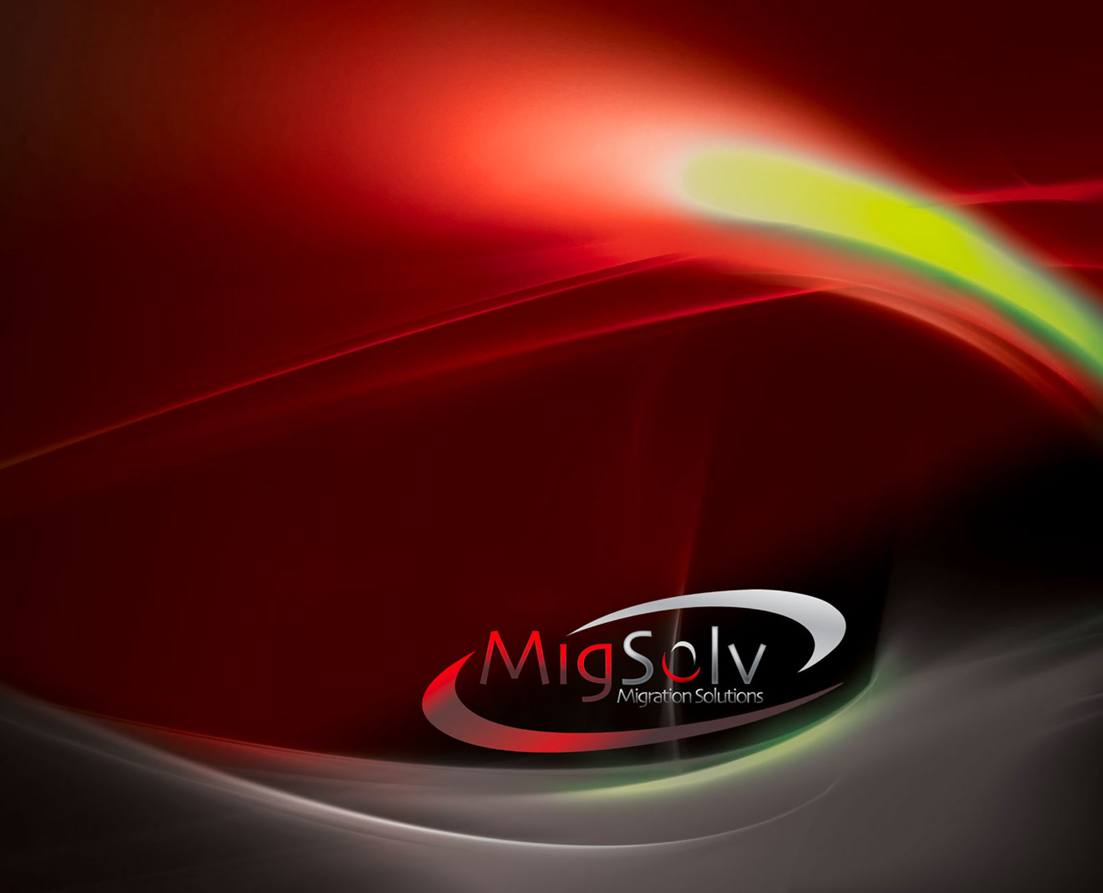

Working closely with the CEO, we began the process of distilling the brand into a refined and future-proof identity. At the heart of this was the development of a new visual system—designed to reflect both the company’s legacy and its ambitions.
Logo Redesign
One of the most sensitive and strategic aspects of the project involved evolving the logo. The investor was keen to maintain visual recognition in the industry, while the CEO wanted a shift toward a more modern, tech-savvy aesthetic.
We took a considered approach—refining rather than replacing:
-
Retained key structural elements from the Migration Solutions logo to preserve recognition.
-
Introduced a sleeker, more modern typographic approach using gradient-infused detailing to imply depth and innovation.
-
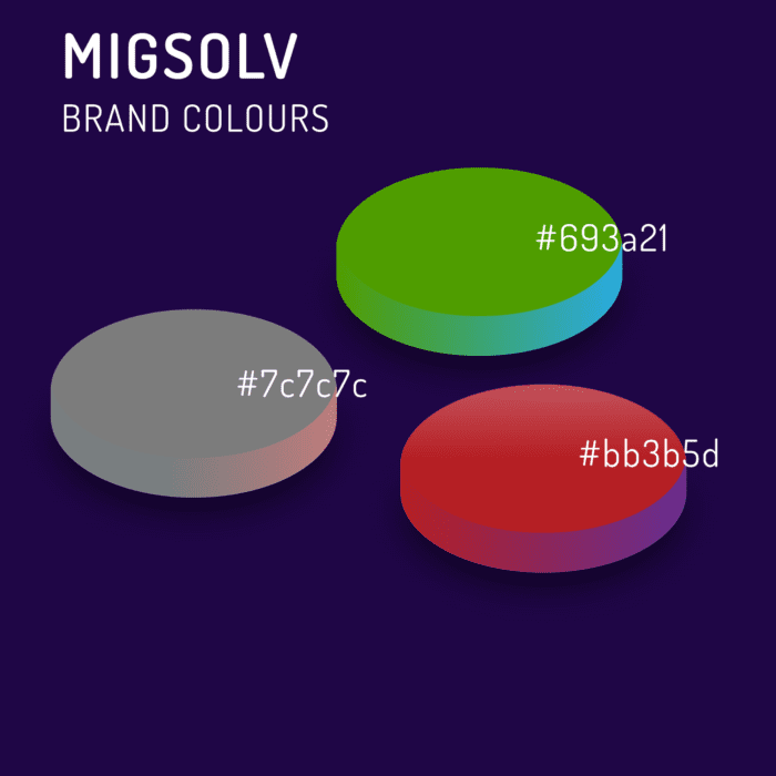
Swapped the original burgundy for a bold, vibrant red, paired with a cool metallic grey to bridge professionalism with technical sophistication.
-
Designed the “O” in MigSolv as a dynamic brand asset—capable of transformation to symbolise different services, campaigns, or ideas. This gave the identity modularity while maintaining brand integrity.
To support brand recognition through the transition, Migration Solutions was retained as a descriptor beneath the new MigSolv logo until the new name established equity in its own right.
Humanising a Technical Brand
To shift perceptions away from “men in grey suits” and toward a more forward-facing, people-first brand, we implemented a number of key visual strategies:
-
Photography: We introduced authentic imagery of the team behind MigSolv, highlighting the human expertise and personality that powered its services.
-
Illustration & Iconography: Bespoke illustrations and icons created visual clarity while reinforcing a more engaging and less rigid tone.
-
Colour Palette: The identity was expanded with the introduction of green, complementing the red and grey and infusing the brand with energy, freshness, and a subtle nod to environmental awareness.
Website Redesign
The website had previously adopted a minimal, white-and-silver design, but analytics revealed high bounce rates and low engagement. We reimagined the digital presence entirely:
-
Parallax Scrolling & Abstract Design: A refreshed, image-led experience with layered storytelling and contemporary visual techniques to elevate brand perception.
-
Responsive by Design: Built to perform seamlessly across all devices—desktop, tablet, and mobile.
-
SEO Optimisation: Structured content, metadata, and clean code helped enhance visibility and drive inbound traffic.
-
CMS Implementation: A bespoke content management system empowered the internal team to manage updates with ease. We provided full training and long-term support.
Website architecture was restructured to align with both user needs and business objectives, ensuring every page was purposeful, informative, and clearly linked to key services and value propositions.

Brand Collatarel & Print

The rebrand extended into every physical and digital touchpoint, ensuring cohesion across all channels.
Business Cards
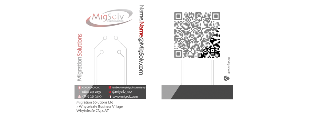
We created a high-impact, concept-driven business card—designed as a mock security badge. It represented MigSolv’s commitment to security, innovation, and sustainability. Produced in biodegradable plastic, it not only communicated the company’s environmental principles but also positioned it as forward-thinking. A QR code on the reverse stored personal contact information—cutting-edge at the time.
Stationery
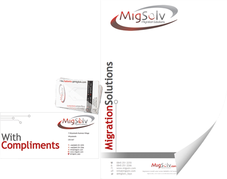
We designed print-ready templates that could be easily used in Microsoft Office while maintaining a sleek, brand-aligned aesthetic. Faded circuit-board-like lines echoed the technical nature of the business without overpowering minimal layouts.
Magazine Adverts
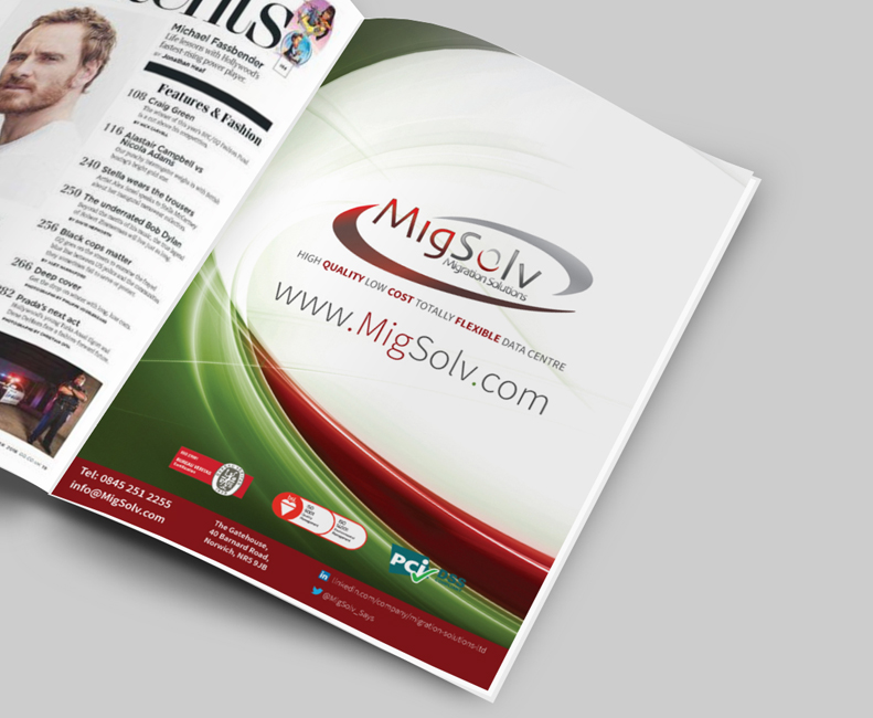
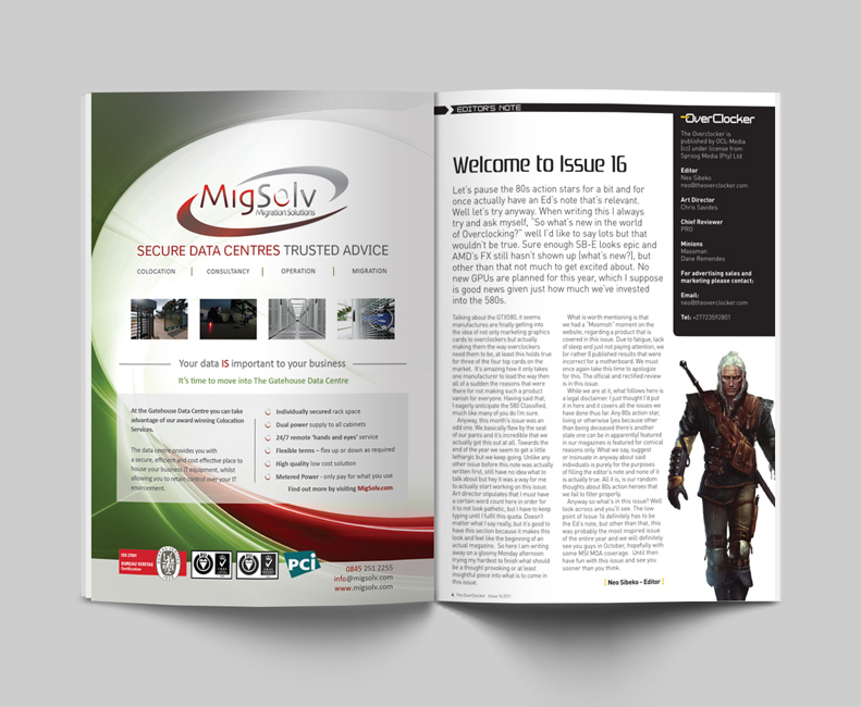
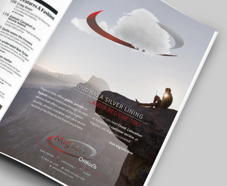
Over time, magazine adverts reflected the evolution of the brand. Early designs used stark red, white, and grey; later iterations began incorporating green, larger imagery, and more human-centered messaging.
Exhibition Design
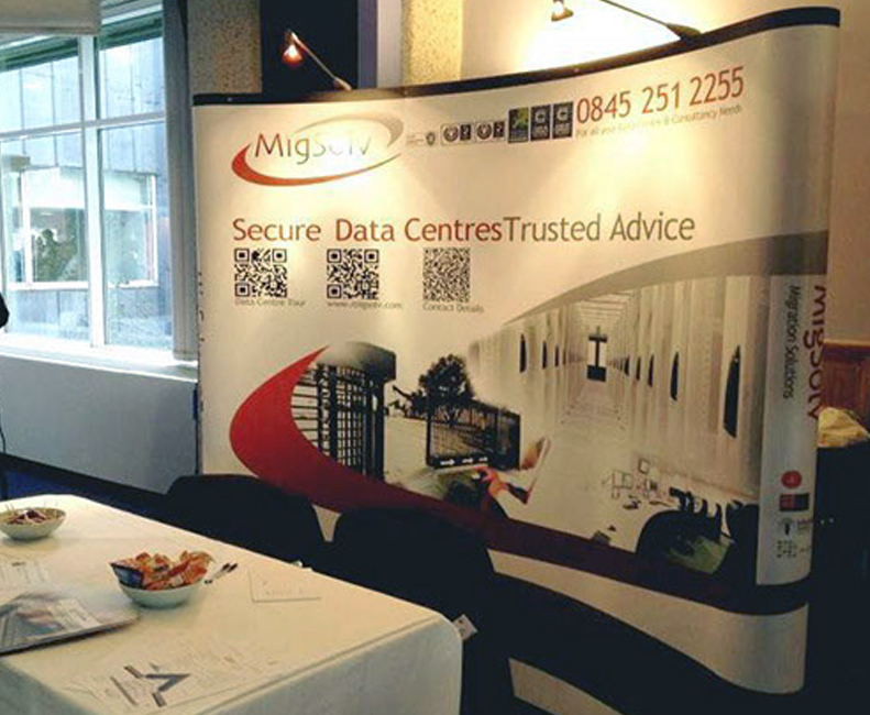
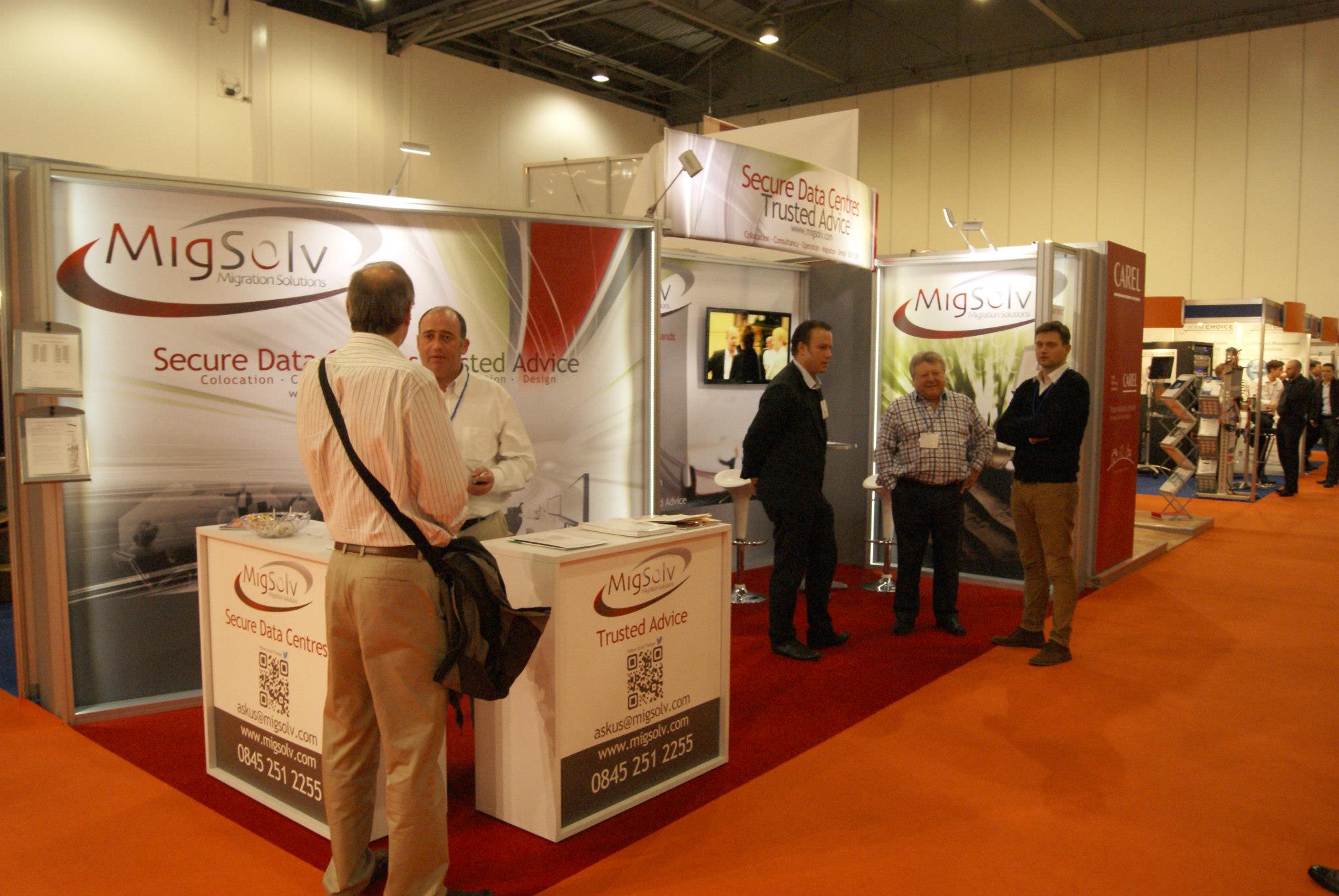
From pop-up stands to full-scale trade show installations, MigSolv’s presence became more dynamic and inviting. Early stands featured clean white space and data-driven loops; later designs embraced green and bolder storytelling to express the brand’s expanding narrative.
Informational Handouts
Handouts maintained the visual language of the website, using symbolic visuals and restrained copy to encourage deeper exploration online. Content was designed for high scan-ability and strategic use of callouts and microcopy to engage B2B readers.
Infographics
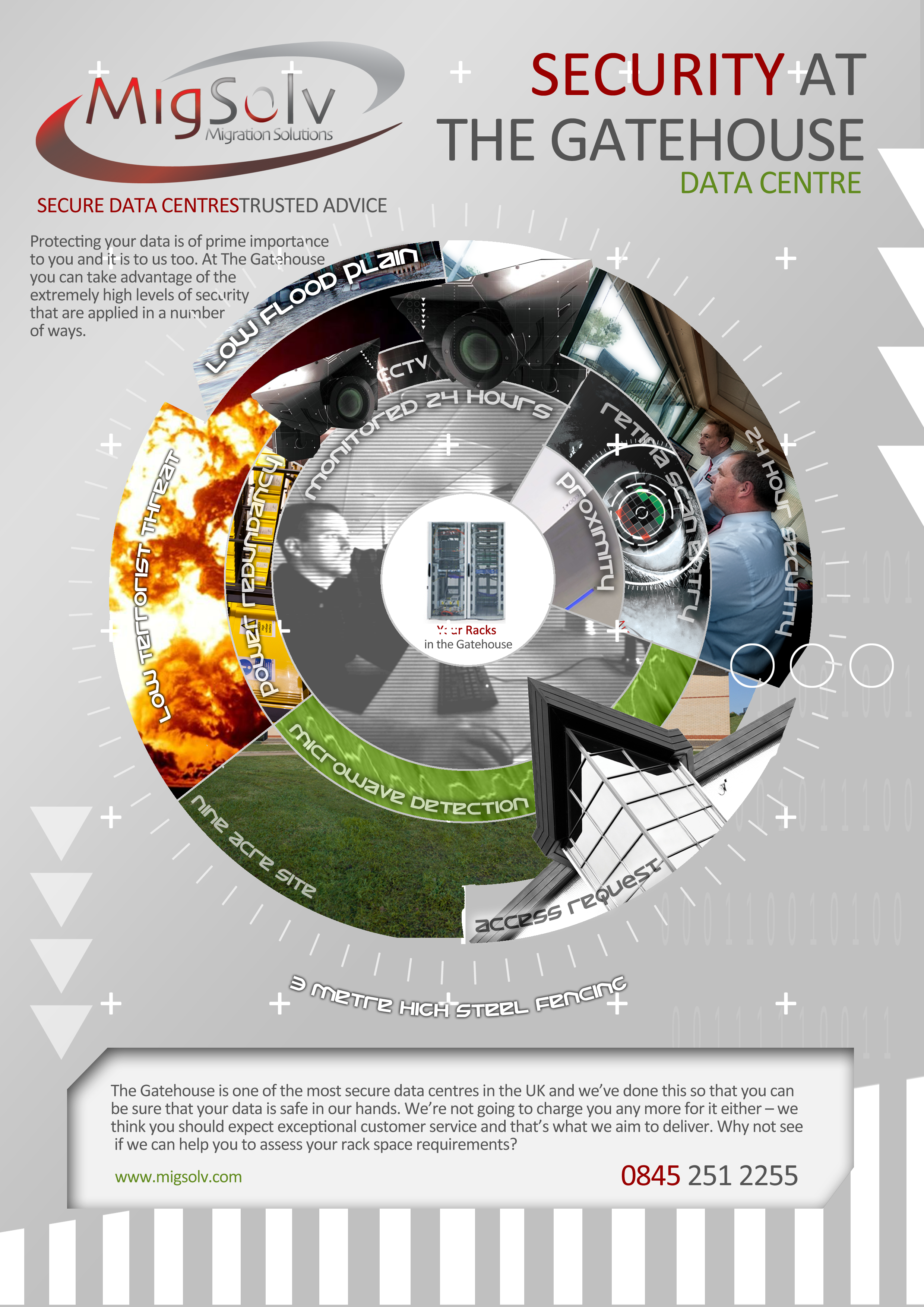
To visualise complex information and enhance shareability, we designed several infographics. One featured a circular visual metaphor—symbolising the unbreakable nature of MigSolv’s security systems, with customer data racks at the protected centre.
Motion Graphics
To support a major industry event in Monaco, we developed a Flash-based animated advert for use at the reception area. This motion piece featured the brand’s strapline “Evaluate, Improve, Control” and presented MigSolv as both a consultancy and data centre operator. The animation reflected the modern tone of the rebrand while reinforcing the company’s dual-service proposition.
Conclusion
The rebrand of MigSolv was a comprehensive, strategically-led transformation rooted in balancing heritage with innovation. Our approach unified the company’s disparate brand elements into a flexible, future-ready identity that:
-
Preserved legacy brand recognition while modernising its visual DNA.
-
Shifted perception from overly corporate to forward-thinking and approachable.
-
Improved digital engagement through a restructured, user-focused website.
-
Established visual and verbal consistency across all communication platforms.
Although MigSolv later entered administration, the rebrand remains a strong example of how insight-driven creative strategy can reposition a business and redefine its presence—internally and externally.
WORK TOGETHER
Like what you see? Let’s chat about how we can bring your next idea to life.

