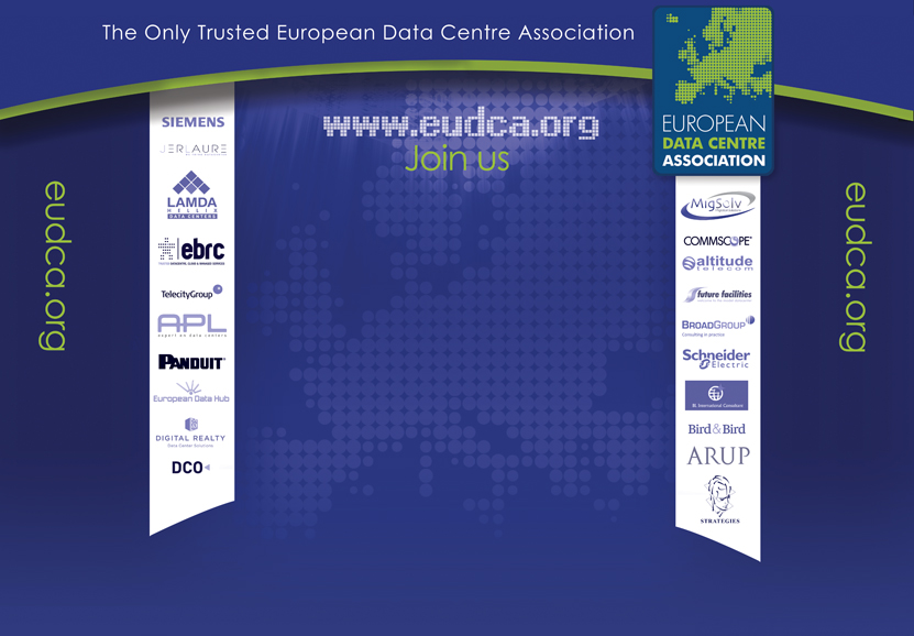
EUDCA Exhibition Stand
This exhibition stand was designed for the European Data Centre Association (EUDCA) to support their presence at industry events and help establish their brand visually in a clear, confident way.
The project began with a goal to create a medium-sized popup stand that would introduce the brand to new audiences in a professional, memorable way. The original concept used light, literal colours — baby blue oceans and soft greens — but the overall result felt too washed out and lacked the visual weight of a modern, forward-thinking organisation.
Design Evolution:
Inspired by the EUDCA’s logo, the new design took a more refined and contemporary approach.
-
We drew directly from the brand’s deep blue palette, slightly adjusting the tone to create a richer royal blue for the banner background.
-
Elements from the logo — specifically the circular shapes — were reimagined as graphic accents, creating an abstract, decorative texture across the stand.
-
This approach moved the design away from literal interpretations and toward a more strategic, brand-driven visual.
The final design presents EUDCA as a modern, credible, and design-conscious organisation, ready to stand out in a competitive event space.
WORK TOGETHER
Like what you see? Let’s chat about how we can bring your next idea to life.
