
In today’s digital landscape, ensuring that your brand’s visual elements are accessible to all users is not just a best practice—it’s a necessity. One critical aspect of digital accessibility is colour contrast. Proper colour contrast ensures that text and important elements are readable by everyone, including individuals with visual impairments. The WebAIM Contrast Checker is a valuable tool that helps designers and developers assess and improve the colour contrast of their digital content.AudioEyeWCAG
Understanding Colour Contrast and Accessibility
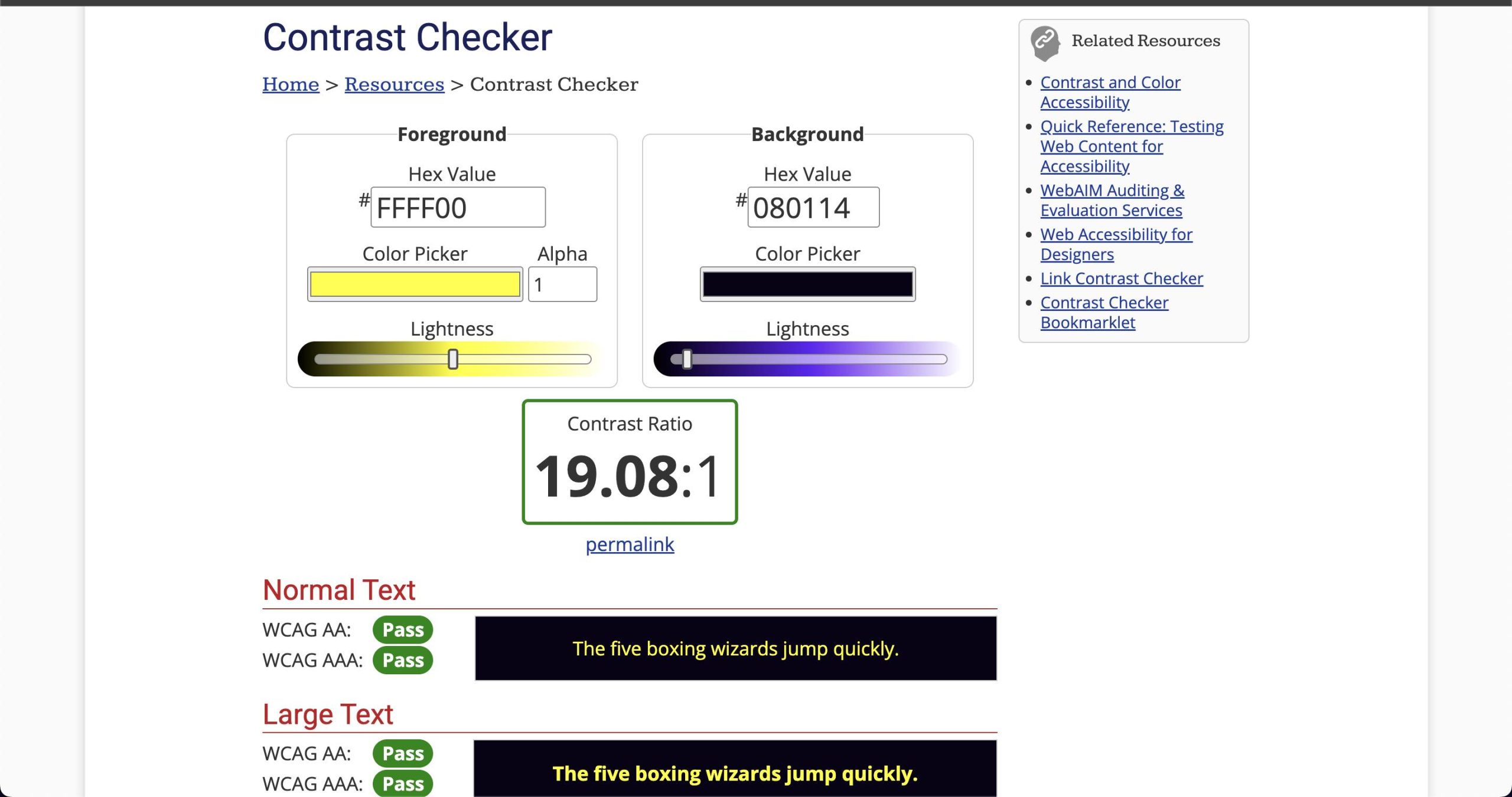
Colour contrast refers to the difference in luminance between two colours, typically between text and its background. The Web Content Accessibility Guidelines (WCAG) provide specific contrast ratio requirements to ensure readability:TPGi+1Accessible Web+1
-
Normal Text: A minimum contrast ratio of 4.5:1 is required.
-
Large Text: A minimum contrast ratio of 3:1 is acceptable.
-
Enhanced Accessibility (AAA Level): A contrast ratio of 7:1 for normal text and 4.5:1 for large text is recommended.AudioEye+4Albuquerque Public Schools+4TPGi+4Albuquerque Public Schools+5TPGi+5webaim.org+5
Meeting these standards is crucial for users with low vision or colour blindness and contributes to overall better user experience.AudioEye+1TPGi+1
Introducing the WebAIM Contrast Checker
The WebAIM Contrast Checker is an intuitive, web-based tool designed to evaluate the contrast between foreground and background colours. By inputting colour values in hexadecimal format or using the built-in colour picker, users can quickly determine if their colour combinations meet WCAG guidelines. The tool provides immediate feedback, indicating whether the selected colours pass or fail the required contrast ratios for both normal and large text. YouTube+8webaim.org+8TELUS+8Albuquerque Public Schools+6webaim.org+6webaim.org+6UW Homepage+7webaim.org+7webaim.org+7
How to Use the WebAIM Contrast Checker
-
Access the Tool: Navigate to the WebAIM Contrast Checker.
-
Input Colours: Enter your desired foreground (text) and background colours using their hexadecimal codes. Alternatively, use the colour picker to select colours visually.YouTube+11accessate.net+11Albuquerque Public Schools+11webaim.org+3webaim.org+3UW Homepage+3
-
Review Results: The tool will display the contrast ratio and indicate compliance with WCAG AA and AAA standards for both normal and large text.Accessible Web+9webaim.org+9webaim.org+9
-
Adjust as Needed: If your colour combination fails to meet the required standards, use the lightness sliders to adjust the colours until compliance is achieved.webaim.org+1webaim.org+1
This straightforward process ensures that your colour choices are accessible to a broader audience.
Enhancing Accessibility with Additional Features
Beyond basic contrast checking, WebAIM offers additional resources to further enhance accessibility:webaim.org
-
Link Contrast Checker: This tool evaluates the contrast between link text and surrounding body text, ensuring that links are distinguishable by more than just colour. webaim.org
-
WAVE Tool: The Web Accessibility Evaluation Tool (WAVE) provides a comprehensive analysis of web pages, identifying accessibility issues, including colour contrast problems. AudioEye
Utilizing these tools in conjunction with the Contrast Checker can lead to a more accessible and user-friendly digital presence.
Why “Colour Contrast Checker” Should Be in Your Toolkit
Incorporating a colour contrast checker into your design and development workflow is essential for several reasons:
-
Inclusivity: Ensures that content is accessible to users with visual impairments.
-
Compliance: Helps meet legal requirements and avoid potential accessibility lawsuits.
-
User Experience: Improves readability and overall user satisfaction.
-
Brand Reputation: Demonstrates a commitment to accessibility and social responsibility.
Regularly using a colour contrast checker like WebAIM’s tool can significantly enhance the accessibility and effectiveness of your digital content.
Final Thoughts
Ensuring that your brand’s colours meet accessibility standards is not just about compliance; it’s about creating an inclusive experience for all users. The WebAIM Contrast Checker is a powerful, user-friendly tool that simplifies the process of evaluating and improving colour contrast. By integrating this tool into your design process, you take a significant step toward making your digital content more accessible and user-friendly.
Remember, accessibility is an ongoing commitment. Regularly reviewing and adjusting your colour choices with a reliable colour contrast checker ensures that your brand remains inclusive and accessible to everyone. If you would like a complete website accessibility audit then please free to explore our service page or contact us.