Articles
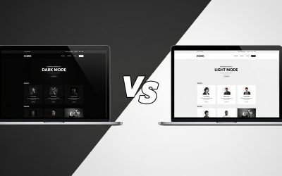
The Ultimate Showdown: Dark Mode VS Light Mode – 7 Key Insights for Brand Perception
TL;DR User preference is split: No single "better" mode exists; it depends on the individual and their environment. Stats reveal diverse tastes: Users show varied preferences for light, dark, or a mix of both. Brand perception varies: Dark mode feels modern, light...

Unmasking the Deceptive Dark Pattern Sneak Into Basket: 3 Ways to Protect Yourself
TL;DR Companies sometimes use a dark pattern sneak into basket tactic, automatically adding items or fees to your online cart. This practice puts the burden on you to notice and remove unwanted charges before paying. Hidden fees exploit your commitment after you've...

Unmasking Deception: 5 Ways the Dark Pattern Confirm Shaming Tricks You Online
TL;DR: Understanding Confirm Shaming Dark pattern confirm shaming makes you feel bad for not choosing the option a website prefers. It presents the desired choice positively and the alternative negatively, often using guilt. This tactic particularly affects people...

Dark Patterns and Mental Health: Exposing 6 Deceptive Designs and Their Alarming Impact
TL;DR: Your Quick Guide Dark patterns are sneaky website designs that trick you into doing things you might not want to. These online tricks often worsen mental health issues like anxiety, impulsivity, and stress. Companies use them to boost sales and keep you hooked,...

7 Key Ways Breadcrumb Navigation on Websites Boosts User Experience
TL;DR Breadcrumb navigation on websites shows you a clear path of where you are. It helps you easily go back to previous pages or explore related topics. This type of navigation makes websites easier to use for everyone, especially those with memory challenges. Using...

7 Simple Steps: How to Make Your Website Articles More Accessible with AI
TL;DR: Universal Design for Learning (UDL) makes content clear for everyone. AI tools can create articles that are easy to read. Good prompts help AI make content that includes all readers. Aim for high readability scores and simple words. Unlock Your Content for...

Why Keyboard Navigation Accessibility Matters for Divi Sites
https://youtu.be/kj9UodcwIes?si=wKpOqK3PfLplQHFG Watch this 3-minute video of Todd Stabelfeldt using a switch device to navigate an iOS interface As web designers, we often focus on visuals — typography, layout, animation, colour — all the details that make a website...

How Much Does It Cost to Get a Website Designed in Liverpool? 2025 Pricing Guide
If you’re wondering how much does it cost to get a website designed in Liverpool in 2025, you’ve come to the right place. Whether you’re a small business, a startup, or someone looking to establish an online presence, understanding the costs behind a professional...

Why :focus-visible CSS is a Game-Changer for Accessible and Aesthetic Web Design
In the world of modern web design, accessibility and aesthetics often seem like they're at odds. Designers want slick interfaces without clunky outlines, while developers and accessibility advocates push for inclusive interaction models that support keyboard...

Should I Use rem in My Websites? Here’s Why You Probably Should.
If you’ve spent any time building websites—whether in Figma, WordPress, or writing raw HTML and CSS—you’ve probably encountered the age-old question: should I use rem in my websites instead of px? The short answer? Yes, in most cases, you should. In this post, we’ll...

A Guide to Using the WebAIM Colour Contrast Checker: Ensure Your Brand Colours Meet Accessibility Standards
In today's digital landscape, ensuring that your brand's visual elements are accessible to all users is not just a best practice—it's a necessity. One critical aspect of digital accessibility is colour contrast. Proper colour contrast ensures that text and important...

Accessible Web Typography: Why I Never Use Fonts Smaller Than 16px
In recent years, a troubling trend has emerged among many younger designers: using font sizes as small as 14px, sometimes even smaller, especially on portfolio sites or design mockups. It’s all in the name of “minimalism,” but here’s the thing: tiny text isn’t clever...
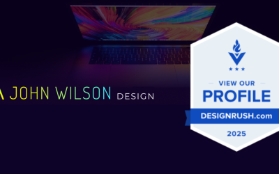
Celebrating Recognition on DesignRush: A Milestone in Web Design Excellence
In today’s fast-moving digital landscape, the importance of professional web design has never been greater. Businesses of all sizes rely on clean, user-focused websites to communicate their brand, connect with their audience, and drive meaningful growth. As someone...
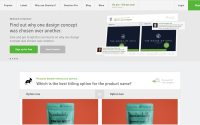
Desinion get others opinions about your design
When creating design elements everyone, no matter who we are has their own opinion of what works and what doesn’t, what is beautiful and what is ugly. Visual cues and hierarchy feel different for different people but you will find that the majority of people will be...

What Makes A Good Therapist Website Liverpool?
Are you a therapist in need of a great therapist website Liverpool? Building a therapist website can be tricky, especially if you’re not sure where to start. Whether you're considering creating it yourself using a drag-and-drop builder like Divi, or hiring a...

Website Design Liverpool – How to Choose the Right Web Designer (And Why It Matters)
If you're a business owner, creative, or entrepreneur in Liverpool, your website is more than just a digital presence—it’s your shopfront, your pitch, and often your biggest sales tool. So if you're searching for website design Liverpool, you're in the right place—but...
A Review of the Interaction Design Foundation (IxDF)
During the many British lockdowns due to COVID, I knew I wanted to improve my design skillset. I had acquired over ten years of web and branding design experience but this wasn't enough. I knew I could improve how I approached my work further by learning UX. As...