EDCG Logo & Collatarel
Who Are They?
In 2015, several data centre companies began exploring the idea of forming a unified identity. This new collaboration aimed to enhance their ability to secure larger contracts while offering clients the added security of housing their equipment across two independently-owned data centres.
This strategic move would provide clients with greater resilience in the event of unexpected disruptions. The first step in establishing the EDCG brand was to create a logo that embodied strength, unity, and shared values.
The Challenge
The concept of EDCG was initiated by Alex Rabbets, Managing Director of MigSolv.
He approached me to create a complete brand identity, including a logo, website, PowerPoint presentation, and supporting collateral to present the idea to other data centre stakeholders.
The Solution
The branding process began with the logo, designed to represent a strong partnership and a forward-thinking, modern organisation. This identity would then guide the visual language used across all marketing materials.
The Logo
Inspiration
To design a logo that felt innovative and appealing, I needed to move away from the traditional image of the data centre industry—often perceived as dull and corporate.
Around this time, cultural shifts, particularly the film Tron: Legacy, began reshaping that perception. With its futuristic visuals, neon lighting, and high-tech themes, Tron became a source of inspiration for bringing energy and style into the EDCG identity.
Conceptual Sketches
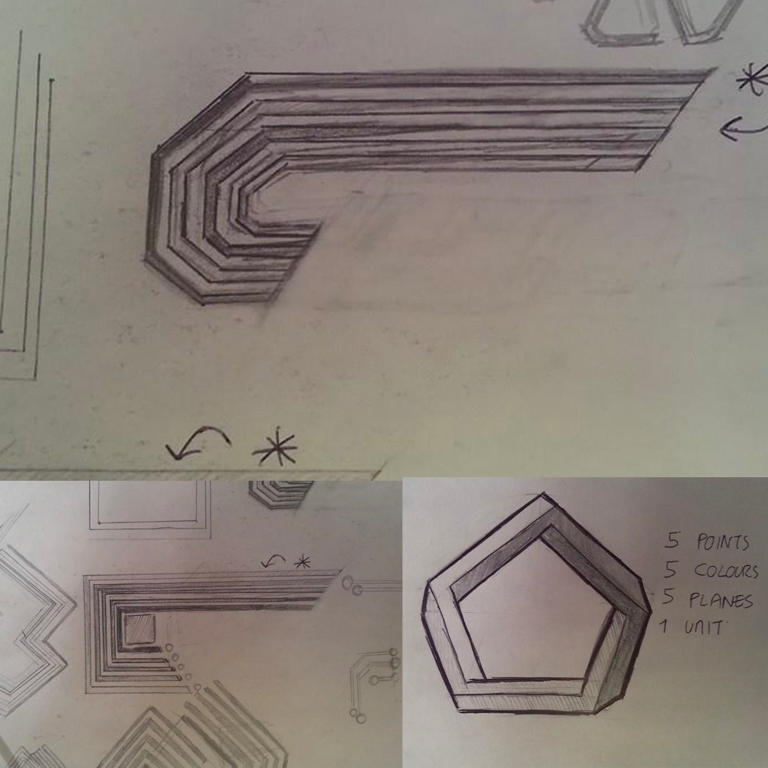
My initial sketches aimed to express the core idea: five independent data centres uniting to form a single, secure, client-focused organisation. I explored geometric shapes and the aesthetic of circuit boards to convey unity, complexity, and continuity.
-
Sketch One – Square Protection
Five lines converge to form a square, symbolising the customer’s data at the centre, protected on all sides. This design drew on elements from circuit boards and the visual language of light and connection inspired by Tron. -
Sketch Two – Moving Lines
A dynamic variation of the first sketch, this design introduced angled lines to suggest motion, speed, and efficiency—qualities central to EDCG’s offering. -
Sketch Three – Pentagon Union
This concept transitioned to a 3D pentagon, with no clear beginning or end, symbolising the infinite strength and cohesion of the data centres working in unison.
Logo Development
Once we narrowed down the preferred sketches, I developed the ideas further using Illustrator CC. I tested various perspectives and elements, including circles and alternate orientations. Eventually, the team and I chose a vertically aligned design with distinct, extended lines to suggest movement and sleekness.
The typography for “EDCG” was intentionally bold and blocky to mirror the logo’s square concept. I experimented with embedding a subtle inward-pointing arrow within the letter “E,” reinforcing the themes of speed and data deployment.
Print & Collateral Design
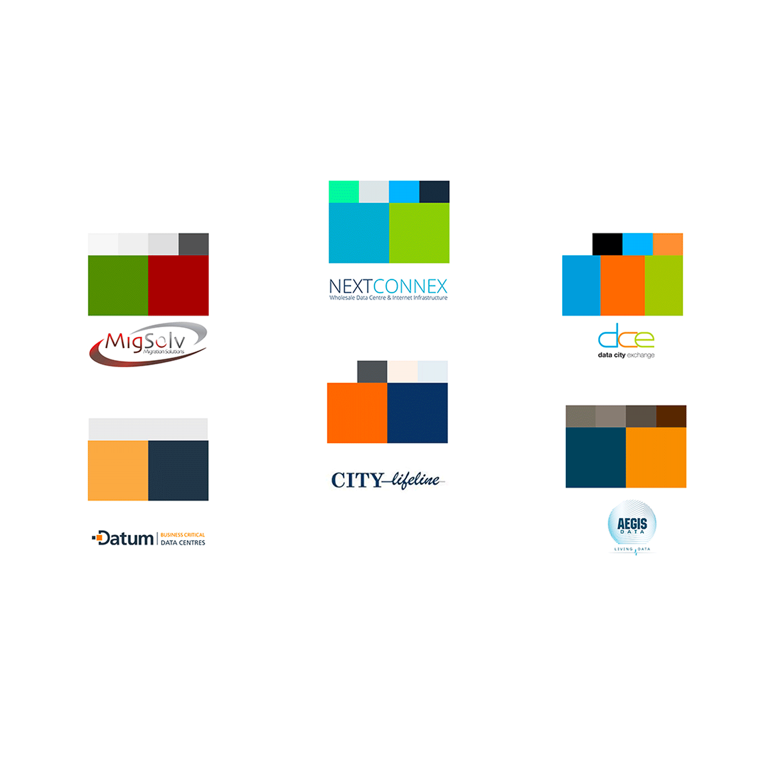
The collateral leveraged the colour schemes of the individual data centre partners, while maintaining EDCG’s signature dark grey and black aesthetic. For example, we created a double-sided service specification handout outlining the benefits and pricing for potential clients—both informative and visually aligned with the new brand.
WORK TOGETHER
Like what you see? Let’s chat about how we can bring your next idea to life.


